
Visuaalinen ilme / Verkkosivut / Brändin graafiset elementit
Visuaalisen ilmeen ja verkkosivujen uudistus kiinteistömarkkinoinnin asiantuntijalle
Insite Finland on kiinteistömarkkinointiin erikoistunut asiantuntijayritys, joka yhdistää visuaalisen suunnittelun, teknologian ja syvällisen alan osaamisen. Yrityksen palvelut ovat laadukkaita ja vaativia, joten myös ulospäin näkyvän ilmeen tuli herättää luottamusta ja vastata tätä tasoa heti ensisilmäyksellä.
Tavoitteena oli kirkastaa Insite Finlandin visuaalista ilmettä ja tehdä siitä selkeämpi, nykyaikaisempi ja helpommin lähestyttävä, kuitenkaan menettämättä tunnistettavuutta tai uskottavuutta. Visuaalinen kokonaisuus rakennettiin rauhallisen ja johdonmukaisen estetiikan varaan, jossa korostuvat selkeys, luettavuus ja harkittu rakenne.
Logon muotokieli ja graafiset elementit pohjautuvat arkkitehtonisiin muotoihin ja tilalliseen ajatteluun, mikä tukee yrityksen ydintoimintaa. Värimaailmaa selkeytettiin ja typografia valittiin tukemaan ammattimaisuutta ja helppoa luettavuutta eri käyttötarkoituksissa.
Verkkosivut suunniteltiin ohjaamaan kävijää loogisesti eteenpäin ja tekemään palvelukokonaisuudesta helposti hahmotettavan. Sivusto tukee myyntiä, vahvistaa asiantuntijamielikuvaa ja madaltaa yhteydenoton kynnystä.
Lopputuloksena syntyi visuaalinen ilme ja verkkosivut, jotka tukevat Insite Finlandin kasvua, vahvistavat luottamusta ja tekevät yrityksen osaamisen näkyväksi selkeällä ja uskottavalla tavalla.


Töitä, jotka syntyivät yhteistyössä
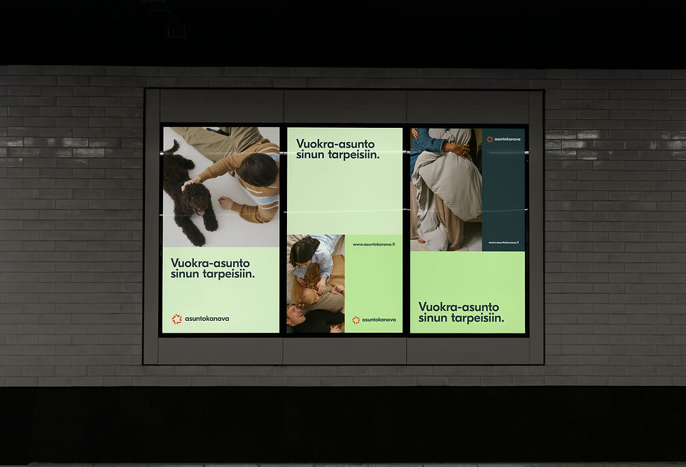
Asuntokanava

Noblevents

Ilmakunnas Engblom